Search Articles

Mad Scientist (Statistics)

Confidence Intervals for Population Means

Confidence intervals are a type of statistical inference where we create an interval using data from a sample and estimate the probability that some population parameter is found within (captured by) that interval.
Intervals are often described in the form "the interval a ± b" (which means the interval from a - b to a + b.)


A level C confidence interval for a parameter is an interval which has a C percent chance of capturing that parameter.

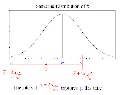
We know that the sampling distribution of x is normal for a population whose distribution is normal, so we know that 95% of the possible values of x lie within 2 standard deviations (2 times σ/√n) of its mean (µ). Thus if we obtain an x from a sample, we can be 95% sure that the value of µ is somewhere between x - /√n and x + /√n.
The interval x ± /√n is a 95% confidence interval for µ. The image below shows this confidence interval around a particular x successfully capturing the mean.


Constructing a Confidence Interval for µ
Known σ
A level C confidence interval for the mean of a normal population (µ) is given by:

x ± z*σ/√n

Where z* is called a "critical value", and is the distance to either side of the mean between which lies C% of the area under the standard normal curve. To find the value of z* for a particular C, use software or a table of z* critical values (below).

(click image for full size version)


e.g. If we want to construct a 95% confidence interval, the value of z* we use is 1.960 (from the table.)

Unknown σ
Usually we don't know the population standard deviation(σ) and thus don't know σ/√n. Instead we have to estimate σ/√n using our sample's standard deviation (s). To do this we use s/√n instead of σ/√n.

The standard deviation of x when estimated from the standard deviation of the sample(s) is called the standard error(SE).

Unfortunately, it's not so simple.
Standardising x using σ/√n gives z, which has the standard Normal distribution, however, standardising x using s/√n gives a different result, t, which has the t(n-1) distribution.

Because the distribution of standardised x using s/√n is not Normal, we cannot use z* to create the interval. Instead with have to use t*, the critical value for the t(n-1) distribution curve.
There are many different t-curves, each with slightly different shapes. These curves are distinguished by a parameter called their "degrees of freedom"(df)
The degrees of freedom is usually marked in brackets next to the t, as with the t(n-1) above. t* can be calculated using software or from a table of t* critical values (below.)

(click image for full size version)


e.g. If our sample size is 30, and we want a 95% confidence interval, then to find t* using the table of t* critical values:
Find the degrees of freedom
df = 30 - 1 = 29
Find the row whose value in the df column is 29.
Then go across that row until we reach the 95% column, and we have our t* value: 2.045

In summary:
A level C confidence interval is given by
x ± t*s/√n
Using the t* value with degrees of freedom(df) n-1 and confidence level C.

As a rough guide for when it's safe to use this t-procedure, use the guidelines for one-sample t-procedures

Wednesday, October 24, 2007

Statistical Inference

Statistical inference is drawing conclusions about populations using data collected from samples of those populations.

Some important statistical inference methods are:

Confidence Intervals
Confidence intervals are a type of statistical inference where we create an interval using data from a sample and estimate the probability that some population parameter is found within (captured by) that interval.

Intervals are often described in the form "the interval a ± b" (which means the interval from a - b to a + b.)

A level C confidence interval for a parameter is an interval which has a C percent chance of capturing that parameter.

Confidence intervals are often used to estimate:
A population mean.
The difference between two population means.
A population proportion.

Tests of significance
Significance tests are a type of statistical inference where information from a sample of a population is used to assess the validity of a claim made about that population. Significance tests look at the properties of the sample, and work out the probability of obtaining such a sample if a given claim about the population is true. This probability is called the "P-value" of the test.

Tests of significance are often used to assess the validity of claims about:
A population mean.
The difference between two population means.
A population proportion.

A two-sided significance test at significance level α will reject a hypothesis when µo (H0's prediction of µ) falls outside the 1 - α confidence interval for µ.

Tuesday, October 23, 2007

Robustness

An inference procedure is robust if it still produces roughly accurate results when the conditions for its use are not met. Procedures can have different degrees of robustness against different influences. Robustness can be influenced by a number of factors, e.g. the number of observations in the samples used for the procedures.

Sampling Distributions & Central Limit Theorem

The sampling distribution of a statistic is the distribution of values that statistic would take in all possible samples of the same size from a population.

The sampling distribution of x
If x is the mean of an SRS of size n taken from a reasonably large population with mean µ and standard deviation σ, then the sampling distribution of x will have a mean of µ, and a standard deviation of σ/√n .

Because the sampling distribution of x has a standard deviation of σ/√n, x is always going to be less variable than individual observations from the population (which has standard deviation σ.)

x is called an unbiased estimator of µ because its prediction of µ tends to be accurate, that is, it doesn't have a systematic tendency to overestimate or underestimate µ.

If a population has a normal distribution then so will its sample mean.

Central Limit Theorem
For any population with a finite standard deviation greater than 0, the sampling distribution of x will always be approximately normal when n is large. How large n needs to be depends on how close to normal the population distribution is, but the sampling distribution of x is always more normal for greater n.

Because of the above, any variable whose values are composites of many small random influences will always have an approximately normal distribution. That's why its so common to encounter data with a normal distribution.

Continue to next section: Statistical Inference

Law of Large Numbers

The more observations in a random sample, the closer that samples mean will come to the population mean. With more observations, individual variations above and below the mean tend to balance each other out. This is similar to how the results of random phenomena tend to occur in set proportions in a large number of outcomes.

Random Phenomena & Random Variables

Random Phenomena
A random phenomenon is one whose individual occurrences yield random results, but display a regular distribution after many repetitions.

For example: When you toss a coin once, the result is random, but when you toss a coin many times, the proportion of tosses resulting in heads will be about equal to the proportion resulting in tails.

The more outcomes are observed, the more closely the results will follow set proportions.

Random Variables
A random variable is a variable whose individual values are determined by a random phenomenon.
Random variables are usually symbolised by capital letters from near the alphabet.

The mean of a sample chosen randomly from a population (e.g. an SRS) is a random variable.

Experiments

Statistics is often used to analyse data from experiments, so its important to know how to gather the data in ways that avoid bias and aren't affected by lurking variables.

Factors - The explanatory variables in experiments.

Treatments - Anything we do to change an explanatory variable to see how it affects a response variable.

Design - The way treatments are assigned to individuals in an experiment.

Double Blind Experiments
A double blind experiment is on in which neither the subjects, nor the people administering the treatment, know what treatment is given to what subject. This is done so that a subjects response wont be influenced by what type of treatment they think they're receiving. It is a way of eliminating bias from an experiment.

Comparative Experiments
Experiments in which different individuals or groups of individuals are given different (or no) treatments, and their responses compared. This is done to control the effects of lurking variables. By comparing two identical individuals/groups in exactly the same setting, with the only difference being the treatment they receive, we know that any difference in their responses can only be due to the difference in their treatments.

Contol - An individual present in a comparative experiment solely for the purpose of comparison. Controls as their name implies control the effects of lurking variables.
Control Group - A group of individuals that acts as a control.

Randomised Comparative Experiments - Comparative experiments in which the treatments are assigned to individuals randomly.
In this type of experiment, the more subjects in each treatment group (a group of individuals receiving the same treatment) the less chance outcomes will affect the experiments results. Differences in individual results will affect the average result of the group less if the group is larger.

Statistical Significance
When there is a large difference in the responses of two large treatment groups in a randomised comparative experiment, it is unlikely to be due to chance. An effect of a treatment is statistically significant if it is large enough that it would be unlikely to occur by chance.

Completely Randomised Design - A design for randomised comparative experiments where the treatment groups are all of equal size.

Block - A group of individuals in an experiment known beforehand to be similar in a way expected to affect their response to a treatment, e.g. an experiment on humans might put the men into one block and the women into another block.

Block Design - An experiment design where treatments are randomly assigned to individuals within blocks. The way the individuals in each block are affected by the treatments is then compared.

Matched Pairs Design - A type of block design in which pairs of similar subjects are used to compare two treatments. Each subject in a pair receives a different treatment from the other. The "pair" in a matched pair experiment can be a single subject who is given both the treatments. In such a case, the order in which the treatments are administered should be random in case the first treatment affects the results of the second.

Lack of Realism
Experiments can suffer from a lack of realism in that the idealised settings created for the experiments may give results that are not applicable in real-world situations.

Saturday, October 20, 2007

Surveys of People

Data obtained from surveys of people is often inaccurate because of the way the surveys are designed and carried out.

Selection Bias
Selection bias is when the sample obtained by a survey fails to represent the population. There are three main ways this can occur.

Voluntary Response - When sample members are people that have volunteered. People who have stronger opinions about something are more likely to volunteer those opinions, so this kind of sample tends to overrepresent those people.

Nonresponse – When people chosen for the survey don’t participate in it. If the kind of people who don’t respond are the type of people with a certain opinion, then the results will be biased.
For example, if you select 1000 people at random from the phone book, ring them up, and ask them “do you respond to telephone polls?” the nonresponse bias will make your results completely meaningless.

Undercoverage – When certain subsets of a population are, for whatever reason, not represented in a sample.

Response Bias
Response bias is when the survey itself affects the kind of responses received. There are two main ways this can occur.

Question Wording – When survey questions are asked in a way that favours certain responses.

Social Desirability – When people don’t give true answers because they are reluctant to admit to unsavoury attitudes or activities, or illegal activities.

Data Analysis

The information we can obtain from analysing data depends on how that data was obtained.
There are two ways of gathering data: observational studies, and experiments.
In observational studies, individuals and their properties are observed without being affected in any way by the study.
Experiments on the other hand, are studies that deliberately influence individuals in order to see how they respond. Variables are changed to see how other variables are affected.

Data Analysis Terms
Population - Any group of individuals we are interested in, e.g. oranges, students,dogs, etc.

Sample – A small proportion of individuals from a population which are used to estimate properties of that population..
Probability Sample (also Random Sample) – A sample for which individuals are selected from a population by a method based on chance.
Simple Random Sample (SRS) – An SRS is a type of probability sample for which individuals are chosen completely at random from a population

Parameter - A number that describes a property of a population.

Statistic - A number that describes a property of a sample.

Confounding – When the effects of an explanatory variable on a response variable cannot be distinguished from the effects of lurking variables on that response variable. In other words: when we cant tell if it’s our explanatory variable, or a lurking variable, that’s affecting the response variable.

Bias – When a study is designed in a way that favors certain results. For example, if you did a study to find out the most popular sport, but only interviewed tennis players.

Statistics are worse than lies.

Statistics can easily be misused or misinterpreted.

Lurking Variables
When examining the relationship between variables, there are often other variables influencing that relationship that can lead us astray. These are called lurking variables.

For example, we might see statistics that say kids with mobile phones have better test scores. This is in reality due to the fact that kids with mobile phones generally have more wealthy parents, ones who can afford to spend more money on their kids education. The parents wealth is a lurking variable.

Association does not imply causation.
Just because there is an association between having a mobile and getting good test scores, doesn't mean the good test scores are caused by the mobile. Giving someone a mobile isn't going to improve their test scores.

Extrapolation
When predicting a value using a regression line you should stick to values within the range of the data you have collected. Just because the data follows a pattern in the range you've examined, doesn't mean that pattern is universal.

For example, if we make a regression line for the relationship between age and number of teeth for people from the age of 0-10, we might see that the number of teeth a person has is double their age. But if we try to extend that out of the range of data we examined, we get very inaccurate predictions. A 50 year old doesn't have 100 teeth. Our regression line only makes valid predictions for people aged 0-10.

Residuals

A residual is the difference between an actual response value, and that value as predicted by a regression line. (y minus y-hat)

Residual Plots
A scatterplot of the residuals vs the explanatory variable is called a residual plot. A residual plot is simply a means of showing the residuals in a clearer way than a normal scatterplot+regression line does. A line should be drawn across the residual plot at y = 0 to make it more clear what the values of the residuals are.

For least squares regression lines, the sum of all the residuals is 0.

Hats and Bars


The symbols above when spoken out loud are said "y-hat" and "x-bar."
The pointy thing is called a "hat" and the line called a "bar."
The hat and bar can be put above any letters e.g. z-hat, q-bar etc.
"(letter)-hat" and "(letter)-bar" can be used instead of symbols in text.

Least Squares Regression Lines

A least squares regression line is a regression line which is drawn in such a way that the sum of the squares of the vertical distances between each point and the line is as small as possible.

The equation for a least squares regression line (where x is the explanatory variable and y the response) is:


x is the mean of x, and y is the mean of y.
Sx and Sy are the standard deviations of x and y

b is the gradient of the line and a is the y-intercept. Calculators and software can find a and b given the values of x and y

Least square regression lines always pass through the point on the graph (x, y)

r2 is the proportion of the total variation in the y values explained by a least squares regression line. It is a measure of how well the regression line explains the relationship between x and y.

Friday, October 19, 2007

Regression Lines

A regression line is a line drawn on a scatterplot that describes the linear relationship between that scatterplots explanatory and response variables. The line is used to predict a value of the response variable for a given value of the explanatory variable.

A regression line is drawn in red on the scatterplot below.


Influential Observations
An influential observation is an outlier that has a great influence on a regression line.
A regression line is made in a way that seeks to minimise the total distance between itself the points on the scatterplot. Because of this, the presence of large outliers can significantly affect its properties. To find out if an observation is influential, the regression line can be redrawn with that observation excluded. If there is a significant difference from the original line then the observation is influential.

Correllation

The direction and strength of the linear relationship between two variables can be described numerically by their correlation(r). The correlation of two variables, x(explanatory) and y(response) is given by the formula:


Where Sx and Sy are the standard deviations of the variables x and y.

Note that the formula standardises the values of the x and y variables. This is done so that units of measurement never need to be taken into consideration.


r is a positive number when the two variables are positively associated, and negative when the variables are negatively associated
.

r is always a number
-1 and ≤ 1.
Values near -1 and 1 indicate that the linear relationship between the variables is strong, while values near 0 indicate that it’s weak.

r is not resistant, that is, it is significantly affected by the presence of outliers.

Scatterplots

Scatterplots display the relationship between two quantitative variables on a graph. The two values are plotted as dots with x - coordinates equal to one variable and y - coordinates equal to the other.
If one of the variables is an explanatory variable it is given the x - axis.


(The amount of water given is the explanatory variable.)

There are 4 important things to look for in scatter plots:

1. Form
The form is the pattern the dots follow.
Some forms are:
Linear relationships - Where the dots appear to follow a straight line, as in the example above.
Curved relationships - Where the dots appear to follow a curved line.
Clusters - Where the dots are clustered together into one or more group/s.

2. Strength
How closely the dots follow the form tells us the strength of the relationship between the variables.

3. Direction
Variables can be described as positively associated or negatively associated.
If two variables are positively associated, that means high values of one of the variables correspond with high values of the other, and low values of one correspond with low values of the other (as in the example above.)
If two variables are negative associated, that means high values of each of the variables correspond with low values of the other.
The type of association the variables have is called the direction of their relationship.

4. Outliers
Any dots far away from all the other dots.

There are not always clear, or in fact any, relationships between two variables, so there is not always a clear form or direction.

To distinguish between the dots plotted for individuals that have different categorical variables (e.g. species of plant,) we can use different colour dots or different symbols altogether, like squares or stars.

Wednesday, October 17, 2007

Explanatory and Response Variables

When examining the relationship between two variables it can sometimes be seen that one of the variables explains, influences, or determines the other. This kind of variable is called an explanatory variable. Its counterpart (the one that it explains/influences/determines) is called the response variable.

Example:
If you did an experiment to see how tall plants grew given different amounts of water, the explanatory variable would be 'amount of water given', while the response variable would be 'height'.

Table of Standard Normal Probabilities (z-Table)

The table of standard normal probabilities (below) gives the areas to the left of z under the standard normal curve.
(click to view full size version)


Tuesday, October 16, 2007

Standardising

Normal curves are all the same when measured in standard deviations.
The turning points in every normal curve are 1 standard deviation to either side of the mean.
68% of the area under a normal curve (68% of a normal distributions observations) is within 1 standard deviation of the mean.
95% are withing 2 standard deviations of the mean, and
99.7% are within 3.

We can find the proportion of observations in a normal distribution greater than or less than a value by describing that value in terms of standard deviations from the mean. Doing so allows us to use known properties of normal curves in general, rather than try to find information about a specific one.

To convert a value to standard deviations from the mean we use the formula:

The result (z) is called a standardised value, or a z-score.
z has the normal distribution N(0,1) - this is called the "standard normal distribution"

The area to the left of z under a standard normal curve can be found using a calculator, computer, or table of standard normal probabilities. This area is the proportion of observations in the distribution less than x. 1 - this area is the proportion of observations greater than x (the area under a density curve = 1, so 1 - the area to the left of z = the area to the right of z.)

To find a value given the proportion of observations less than or greater than it, simply do the above in reverse.

Continue to next section: Sampling Distributions

Normal Curves

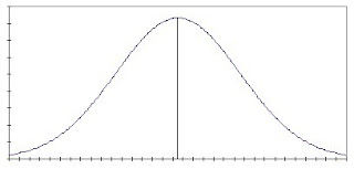
"Normal curves" are a particular type of density curve that describe a particular type of distribution. They are symmetric, single peaked, and bell-shaped as this diagram shows.


The mean of a normal curve is the same as its median.
The type of distribution that is described by a normal curve is called a "normal distribution" and is encountered very often when examining data. The normal curve has known properties which we can use to obtain information about a normal distribution.

Normal curves can be described entirely by their mean and standard deviation.
The mean is the middle point of the curve (represented by the vertical line in the middle of the diagram.)
The standard deviation is the distance of the turning points of the curve to either side of the mean. The turning points are the points on either side where the curve changes from becoming more steep to becoming less steep. They are roughly marked in the diagram below.


For this reason, normal curves are often described by the notation N(µ, σ)

Approximately 68% of the area under a normal curve lies between the points µ- σ and µ+ σ (the turning points.)
Approximately 95% of the area under a normal curve lies between the points - σ and + σ.
Approximately 99.7% of the area under a normal curve lies between the points - σ and + σ.


Continue to next section: Standardising

Density Curves

A density curve is a curve that gives a rough description of a distribution. The curve is smooth, so any small irregularities in the data are ignored.


Density curves are always drawn above the horizontal axis on a graph.
The area under a density curve (between the curve and the horizontal axis) is always defined as 1 unit.
The area under a density curve between two values is the proportion of observations in the data set that fall between those two values.

When a distributions density curve is similar enough to a density curve with known properties, we can use those properties to obtain information about the distribution.

Because a density curve is an idealised description of a distribution, rather than a perfectly accurate one, its mean and standard deviation are slightly different from those values of the actual data. Because they are different, they are given different symbols. The mean of a density curve has the symbol µ, while the standard deviation has the symbol σ.

Continue to next section: Normal Curves

Measures of Spread 2 - Standard Deviation

Another way of describing the spread of a distribution is by describing the differences between individual observations and the mean.
To do this we use the standard deviation(s).
The standard deviation is defined as the square root of the variance(s2).
The variance is found using the formula below:

It takes too long to work this out by hand, so use a calculator or a computer.

The standard deviation is heavily influenced by outliers, just like the mean, so it may not be meaningful in some situations.

Sunday, October 14, 2007

Measures of Spread

The 'spread' of a set of data is a description of how the values of that data are distributed/dispersed.

Range

Range is the simplest measure of spread, it is simply the difference between the largest(maximum) and smallest(minimum) values in a set of data.
For example: the range for the data
1,2,2,3,3,3,4,4,5
is 5 - 1 = 4.
The range tells us little about the distribution of the data and is greatly influenced by outliers.

Quartiles
The quartiles are 3 numbers that divide a distribution into quarters.
The 1st quartile Q1 is the median of the first half of the distribution.
The 2nd quartile Q2 is the median of the whole distribution.
The 3rd quartile Q3 is the median of the second half of the distribution.

Five-Number Summary
A five-number summary is a numerical summary of a distribution, it gives the minimum, Q1, median, Q3, and maximum - in that order.

For example: the five-number summary for
1,2,2,3,3,3,4,4,5,6,7
is
1 2.5 3 4.5 7

Boxplot
Boxplots are graphical representations of five-number summaries.
To make a boxplot:
1. Draw a box between the the first and third quartiles.
2. Draw a line across the box at the median.
3. Draw lines extending out from the box at either end to the maximum and minimum.
4. Outliers can be marked separately on the diagram by a cross, box, line, etc.

Box plot of five-number summary in example above.

Skewedness

Symmetric
A distribution is said to be symmetric when the observations are arranged in a similar way on both sides of the median - as in the histogram below.


In roughly symmetric distributions the mean is roughly equal to the median.

Right Skewed
A distribution is said to be right skewed when most of the observations are clustered around the median while a few observations have significantly higher values - as in the histogram below.


In right skewed distributions the mean is greater than the median.

Left Skewed
A distribution is said to be left skewed when most of the observations are clustered around the median while a few observations have significantly lower values - as in the histogram below.


In left skewed distributions the mean is less than the median.

Time Plots

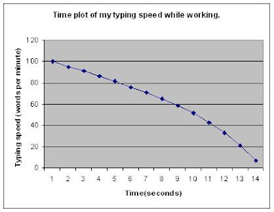
Time plots are used to display the change in a variable over time.
The value of the variable is plotted at constant intervals over time, then the plotted points are connected by lines.

Measures of Centre

The Mean
The mean of a set of observations is the average value of those observations. It is found by adding all the observations together and dividing the result by the number of observations. This is shown by the formula

The mean can be greatly influenced by outliers.

The Median
The median is the middle value in a distribution, half the observations fall below it, and half above.
e.g.
The median of
1,2,3,4,5
is 3.

If there are an even number of observations, the median is the mean of the two middle numbers.
e.g.
The median of
1,2,3,4,5,6
is the mean of 3 and 4, which is 3.5.

As the median is the value in the middle of the observations, it is relatively unaffected by outliers. If the final number in the data set above was 999 rather than 6, the median would still be 3.5. Because of this, the median is said to be a resistant measure of centre.

Saturday, October 13, 2007

Stemplots

Stemplots are similar to histograms in both in their appearance, and the way they sort data into groups.

To make a stemplot:
1. Divide each observation into two parts, the steam and the leaf. The stem is all but the last digit of the observation, the leaf is the last digit.
2. Write each unique stem in a column from smallest to largest.
3. To the right of each stem, write the leaf of each observation with that stem, from smallest to largest.

For example:
Organising the data
49, 52, 56, 72, 81, 89, 67, 87, 56, 67, 73, 87, 91, 56, 103, 79, 82
into a stemplot, would produce this result.


As you can see, a stemplot resembles a histogram turned on its side.

In order obtain a more meaningful representation of the distribution you may round the observations (e.g. to the nearest 10,) or split the stems.
To split the stems write each number in the stem column twice. To the right of the first put the leaves 0-4, to the right of the second put the leaves 5-9. This is done when there are many observations in order to give more detail. Stems can be split into more than 2 if necessary.

Friday, October 12, 2007

Histograms

A histogram is a graph that displays the distribution of a quantitative variable.

In a histogram data is divided into classes, with individual values grouped into those classes. The number of individuals in each class is the height of the bar drawn on the histogram above the class limits.

For example:
If a group of students had the following weights in kg:
49, 52, 56, 72, 81, 89, 67, 87, 56, 67, 73, 87, 91, 56, 103, 79 and 82.
A histogram of these weights could look like the graph below.

You choose the number of classes for a histogram, too many or too few will effectively make the histogram meaningless.
Computer statistics packages like SPSS or SPLUS generally choose the best classes automatically.